파이썬 라이브러리 Matplotlib(Python Library Matplotlib)
Matplotlib : 데이터를 시각화하는 라이브러리(모듈)
※ import matplotlib.pyplot as plt : matplotlib.pyplot 모듈을 import하고 plt라는 별칭으로 부르겠다. ( plt 사용 권장 )
1. 선 그래프(line plot) : plt.plot()
※ 스타일 옵션
| 스타일 옵션 종류 | 마커 종류 정의 | 약자 |
| color | 선 색깔 | c |
| linewidth | 선 굵기 | lw |
| linestyle | 선 스타일 | ls |
| marker | 마커 종류 | |
| markersize | 마커 크기 | ms |
| markeredgecolor | 마커 선 색깔 | mec |
| markeredgewidth | 마커 선 굵기 | mew |
| markerfacecolor | 마커 내부 색깔 | mfc |
※ Line style 설정
| Character | Description |
| '-' | Solid line style |
| '--' | Dashed line style |
| '-.' | Dash-dot line style |
| ':' | Dotted line style |
※ Line color 종류
| Character | Color | Character | Color |
| 'b' | Blue | 'm' | Magenta |
| 'g' | Green | 'y' | Yellow |
| 'r' | Red | 'k' | Black |
| 'c' | Cyan | 'w' | White |
※ Marker
| Character | Description | Character | Description |
| '.' | Point marker | '1' | Tri_down marker |
| 'o' | Circle marker | '2' | Tri_up marker |
| 'v' | Triangle_down marker | '3' | Tri_left marker |
| '^' | Triangle_up marker | '4' | Tri_right marker |
| '<' | Triangle_left marker | '*' | Star marker |
| '>' | Triangle_right marker | 'h', 'H' | Hexagon1, 2 marker |
| 's' | Square marker | '+' | Plus marker |
| 'p' | Pentagon marker | 'D' | Diamond marker |
| '|' | Vline marker | '_' | Hiline marker |
x = [1, 2, 3, 4]
y = [2, 4, 6, 8]
plt.plot(x,y)
plt.show() # 그래프 출력
| 각종 서식 만들기 | |
| plt.xlim() | x축 범위 조정 |
| plt.ylim() | y축 범위 조정 |
| plt.figure(figsize=(x축길이,y축길이)) | 그래프 출력 길이 조정 (단위 : inch) |
| plt.xticks([, , , ,]) | x축 간격, 눈금값 |
| plt.yticks([, , , ,]) | y축 간격, 눈금값 |
| plt.xlabel() | x축 이름 |
| plt.ylabel() | y축 이름 |
| plt.legend() | 범례 (loc='best'를 주면 자동으로 최적 위치에 위치) |
| plt.grid() | 그래프 눈금선 |
| plt.title() | 그래프 제목 |
# 여러개의 그래프 출력
x = [1,2,3,4]
y = [2,4,6,8]
z = [3,6,9,12]

plt.plot(x, ls=':', c='r', marker='o', mfc='b', label='x') # x선을 그리고 'x'라벨
plt.plot(y, ls='--', c='b', marker='s', mfc='m', label='y') # y선을 그리고 'y'라벨
plt.plot(z, ls='-.', c='g', marker='p', mfc='k', label='z') # z선을 그리고 'z'라벨
plt.xlim(0,4) # x축 범위 조정
plt.ylim(0,13) # y축 범위 조정
plt.xticks([0,1,2,3,4]) # x축 간격, 눈금값
plt.yticks([0,2,4,6,8,10,12]) # y축 간격, 눈금값
plt.xlabel('x') # x축 이름
plt.ylabel('y') # y축 이름
plt.legend(loc='best') # 범례
plt.grid()
plt.title('my graph') # 그래프 제목
plt.show()
2. 막대 그래프(bar graph) : plt.bar()
※ 경고창 무시 모듈
import warnings
warnings.filterwarnings(action='ignore')
※ 한글 출력 모듈
from matplotlib import rc
rc('font', family='Malgun Gothic')
 # 경고창 무시
import warnings
warnings.filterwarnings(action='ignore')

# 한글 표현하기
from matplotlib import rc
# 폰트 설정
rc('font', family='Malgun Gothic') # 시스템에 설정된 이름

x = ['재석','명수','준하','형돈','홍철','하하']
y = [80,85,70,60,50,90]
plt.bar(x,y)
plt.show()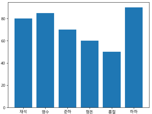
▶ 데이터 분석 실습
전국 사망 교통사고 데이터를 활용하여 분석, 시각화
※ pandas 데이터 불러오기
pd.read_파일형식('주소경로')
※ DataFrame이름.head() : 상위 5개 데이터
※ DataFrame이름.tail() : 하위 5개 데이터
data = pd.read_csv('./data/Traffic_Accident_2017.csv', encoding='euc-kr')
data
data.info()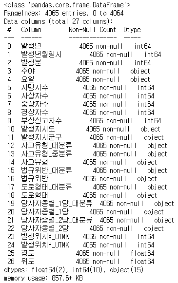
data.head() # 상위 5개 데이터
data.tail() # 하위 5개 데이터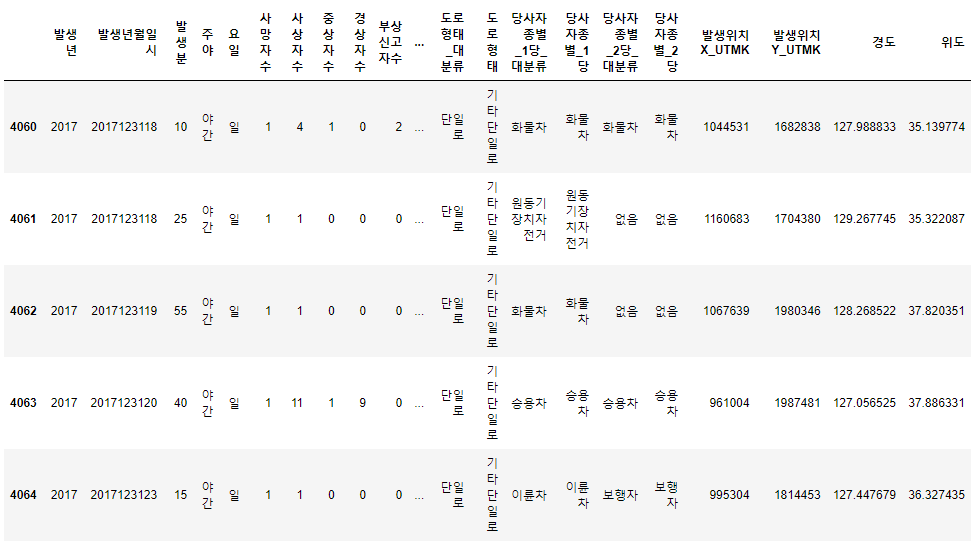
▶ 연습
교통사고 사망자 수를 카운트 하기
# 교통사고 사망자 수 카운트
data['사망자수'].value_counts()
# 사망자는 대부분 1명이라는 점을 알 수 있음
▶ 예제
요일별 사고 건수를 카운트해서 확인하고 요일 순서대로 막대그래프 그리기
display(data['요일'].unique()) # 요일 데이터에 빈 요일이 있는지 확인
data_w = data['요일'].value_counts() # 요일 데이터에 카운트를 해서 사고건수 집계
display(data_w)
data_w = data_w[['월','화','수','목','금','토','일']] # 요일 데이터를 요일 순서대로 다시 만들기
display(data_w)

# 시각화
x = data_w.index
y = data_w.values
plt.bar(x,y)
plt.ylim(500,650)
plt.xlabel('요일')
plt.ylabel('사고건수')
plt.title('요일별 교통사고 건수')
plt.show()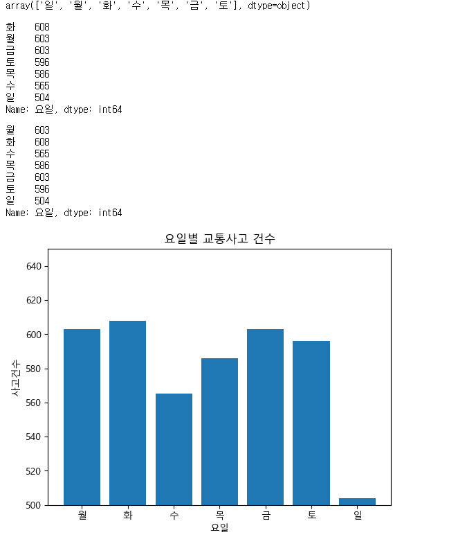
※ pandas DataFrame의 모든 행, 열을 파이썬에서 직접적으로 한 번에 보고 싶을 때
pd.set_option('display.max_rows', None)
pd.set_option('display.max_columns', None)
▶ 실습
'차대차' 사건 중 사상자 수가 많은 발생지 시도를 알아보고 시각화하기
car = data[data['사고유형_대분류']=='차대차']
car_loc = car[['발생지시도','사상자수']].groupby('발생지시도').sum()

x = car_loc.index
y = car_loc['사상자수']

# y에 car_loc.values를 사용하기
# bar chart는 2차원 Numpy배열이기 때문에 1차원 형태로 변환 필요 (for문)
# car_loc1 = []
# for i in range :
# 	car_loc1.append(car_loc.values[i][0])
# y = car_loc1

plt.bar(x,y)
plt.xlabel('사상자수')
plt.ylabel('지역명')
plt.title('차대차 교통사고의 사상자 수 - 지역별')
plt.show()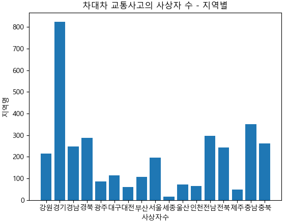
'Python' 카테고리의 다른 글
| 파이썬 크롤링 requests, BeautifulSoup 멜론 Top100 차트 데이터 수집 (0) | 2023.01.18 |
|---|---|
| 파이썬 크롤링 requests, BeautifulSoup (0) | 2023.01.16 |
| 파이썬 라이브러리 Pandas (Python Library Pandas) (0) | 2023.01.15 |
| 파이썬 라이브러리 Numpy (Python Library Numpy) (0) | 2023.01.12 |
| 파이썬 함수(Python Function) (0) | 2023.01.10 |


댓글